


- PENGOPERASIAN PUSAT KELULUSAN SETEMPAT, BAHAGIAN PENGURUSAN PEKERJA ASING
- . FUNGSI ONE STOP CENTRE (OSC), BAHAGIAN PENGURUSAN PEKERJA ASING (BPPA), KEMENTERIAN SUMBER MANUSIA
- SYARAT/KRITERIA ASAS PERMOHONAN KUOTA PENGGAJIAN PEKERJA ASING
- . SYARAT/KRITERIA ASAS PERMOHONAN KUOTA PENGGAJIAN PEKERJA ASING
- . SYARAT MINIMUM PENGGAJIAN PEKERJA ASING
- . NEGARA SUMBER BAGI PENGGAJIAN PEKERJA ASING
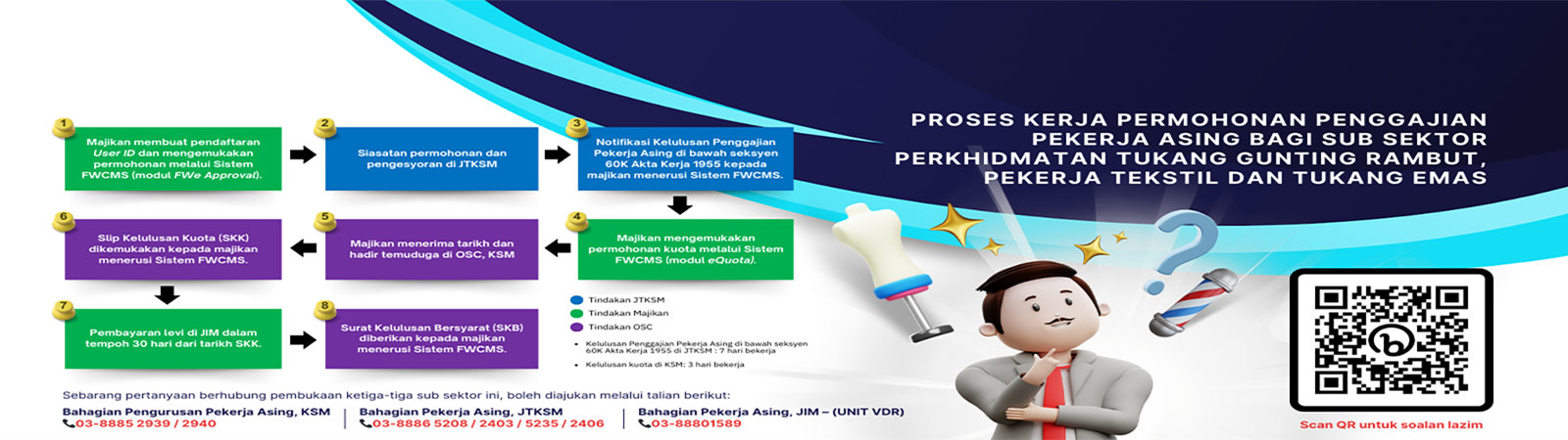
- . PROSES PERMOHONAN KUOTA PENGGAJIAN PEKERJA ASING